Mini-Review: ValueInvesting.io Backtesting

“Backtesting” is a commonly-used tactic to see how well the portfolio you have (or are considering) would have performed historically. While “past performance does not guarantee future results” it’s better than not knowing.

I stumbled upon valuetesting.io when I was trying to backtest…something, I don’t really remember what I was up to. Anyway, my random internet walk found valueinvesting.io, which seems to be chock full of all kinds of tools that I haven’t looked at, so I’m just going to focus on the backtesting tools, which I did spend a few hours playing around with. You have to navigate to https://valueinvesting.io/backtest-portfolio to access this portion, and if you want to save portfolios, you have to create an account.

So what, in a nutshell, does this tool do? In their words:

Our portfolio backtesting tool allows you to evaluate the historical performance of up to 3 portfolios. We support 2 portfolio types: asset classes and tickers (stock, ETF, mutual funds). Multiple backtesting scenarios are supported such as periodic capital inflows or outflows, allocation rebalancing frequency and leverage type. Our tool provides historical returns, risk metrics, drawdowns and rolling returns information about your selected portfolios.

https://valueinvesting.io/backtest-portfolio

Let’s take a look at the two kinds of portfolio types they support: asset classes and tickers.

Backtesting using asset classes

The downside of this tool as a Canadian investor is pretty obvious when you try to build a portfolio using asset classes. (Asset classes are integral to the way I think about my retirement portfolio — you can read more about my approach here.) There’s no “Canadian Equity” category to choose (boo!).

The class that would hold the most Canadian equity would be “Intl Developed ex-US Market”1, so let’s compare that to say the “US Large Cap” (which I take to be a good proxy for the S&P 500).

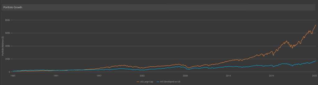
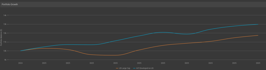
The good old S&P has left the rest of the developed world in the dust, it seems…Well, except for THIS year:

Anyway, the asset classes are good fun and all, but without a Canadian index to track, it’s not too useful to me. (And, inexplicably, nowhere could I find a definition of any of these in the tool, and an email to the support address remained unanswered at the time of publication). So let’s move on to something more interesting, namely the ticker backtesting!

Ticker Backtesting

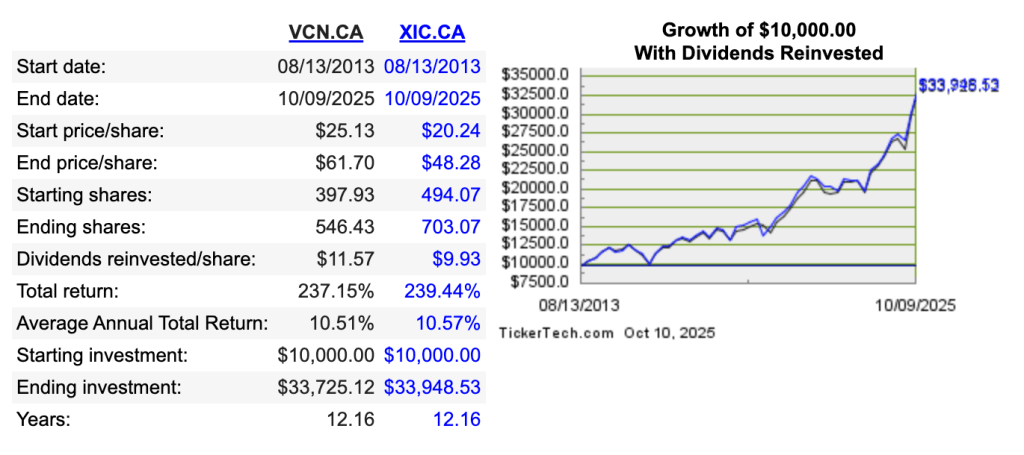
As the name implies, this portion allows you to enter tickers, and there’s full and complete support for Canadian ETFs that I tried.

So of course I immediately tried to build my idealized portfolio, which is what my “What’s in my Retirement Portfolio” would look like without the non-registered assets2.

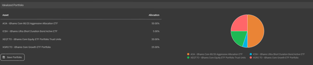
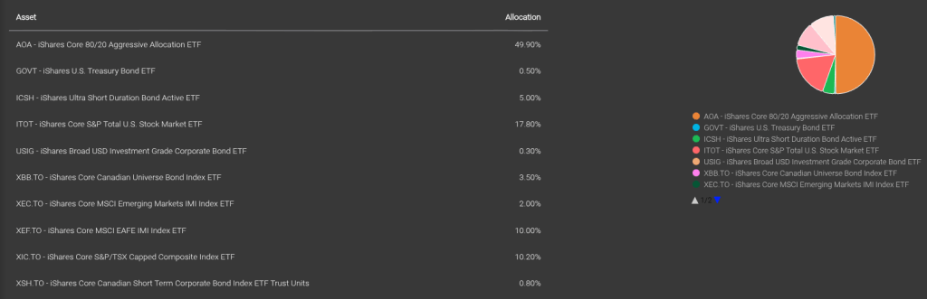
The problem? XEQT and XGRO (two of my ETF all-stars) haven’t been around all that long, and so I can’t backtest very far. No matter, by looking at the composition of XEQT and XGRO and doing some clever math, I can create the equivalent decomposed portfolio:

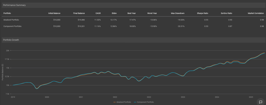
And I can prove that I got it right by backtesting the two against each other. Pretty good, eh?

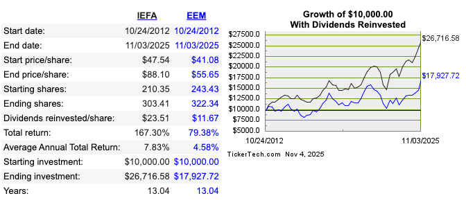
So with my decomposed portfolio at the ready, I can compare its performance long-term against (for example) just buying the S&P 500 index (VOO) or the International Developed ex-US index (VEA).

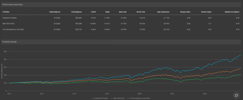
As expected, my portfolio has quite a bit poorer performance than the S&P, but better than the International ex-US. The bond/cash component smooths out the standard deviations (that’s “volatility”) so my worst years (although still a bit scary) are still a bit less than experience of owning 100% equity.

One more thing to look at — this backtesting assumes we don’t rebalance anything. That’s not correct, since that’s one of the benefits of holding ETFs like AOA, XGRO and XEQT — they automatically rebalance periodically. valueinvesting.io lets you choose monthly, quarterly, semiannually and annually. I know for a fact that AOA rebalances twice a year, so we will assume XGRO/XEQT do the same. This is what the result looks like:

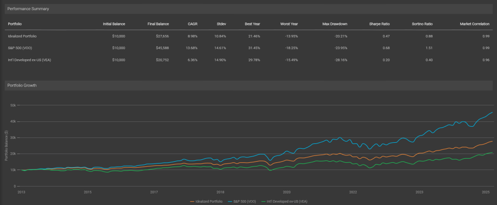
This reduces the volatility and the return a bit, which if you stop and think about it, makes sense: equities consistently outperform bonds and cash over time so the rebalancing exercise makes sure the equities remain at an 80% contribution to the portfolio.

Conclusion

The backtesting portion of valueinvesting.io is a good tool to test various combinations of ETFs / stocks you may be interested in. There’s not very much documentation on the site, but it’s easy enough to use. The free account (which requires registration) is enough to get you that far.

  1. Did a bunch of tests and determined that VEA was the ETF that matched the performance of this index most closely. This ETF is about 11% Canadian Equity. ↩︎
  2. The non-registered assets are being sold off, little by little, to fund my retirement. This year, they have provided about 2/3 of my “salary” (RRIF minimum payments gave me the other 1/3), so I am –slowly– drifting toward the ideal portfolio. The AOA percentage in the ideal portfolio will get smaller over time as I transmogrify it as needed to XGRO using Norbert’s Gambit. ↩︎

Under the hood of XEQT et al

In a previous post, I took a look at the major fund companies’ all-in-one-funds with a focus on what passive indices each of them folllowed with regards to Canadian equity, US equity, International equity, and bonds. That assessment found that iShares and BMO were very similar, but TD and Vanguard looked very different.

But do different indices really make a difference in terms of what each of these companies hold when it comes to equities? That’s what we’re trying to find out. Let’s take a look at each of the categories in turn.

Canadian Equity

Let’s take a look at the top Canadian equity holdings of TEQT, XEQT, ZEQT and VEQT1:

StockTEQT %XEQT %ZEQT%VEQT%
RBC1.651.731.621.80
Shopify1.551.691.621.49
TD1.121.161.101.16
Enbridge0.840.880.850.92
Brookfield0.820.820.780.81
BMO0.740.770.720.77
Agnico0.660.690.680.63
Scotiabank0.640.670.630.68
CIBC0.600.630.600.63
CP KC0.570.580.570.62
# held292215215156
Top 10 %9.199.629.179.51
Top Canadian Equity Holdings for TEQT, XEQT, ZEQT, VEQT per ETF factsheets, October 2025

VEQT has fewer holdings than the others, and this indicates slightly more concentration/slightly less diversification than the other funds. TEQT is at the top of the heap when it comes to the number of companies held, with XEQT and ZEQT looking pretty similar. My take here is that the differences between TEQT/XEQT/ZEQT/VEQT are pretty slight when it comes to Canadian equity. The Canadian equity indices these funds track may be different, but the differences are pretty minor, and might simply be attributable to tracking errors; how often and when these funds rebalance their holdings may explain the differences shown here.

But just for fun, I looked at comparing VCN (which is underneath VEQT, and tracks the FTSE Canada all cap) to XIC (which is underneath XEQT, and tracks the S&P/TSX Capped Composite) and found this using https://www.dividendchannel.com/drip-returns-calculator/ (which is also listed in Tools I Use).

This indicates a tiny advantage to XIC aka the capped composite index, but there’s not a lot of daylight between these two returns!

On the Canadian Equity front, I declare the 4 funds EQUIVALENT!

US Equity

The US weighting is NOT the same for each of these funds, so making a one-to-one comparison is a bit tricky.

  • TEQT: 55% US
  • ZEQT: 50% US
  • XEQT, VEQT: 45% US

What I show in the table below is the percentage of the US portion held by the fund. So in other words if stock XYZ makes up 5% of the US holdings of TEQT and XEQT, it means that TEQT actually holds more of XYZ because 55 cents of every dollar of TEQT is invested in XYZ as compared to 45 cents for XEQT et al.

StockTEQT: TPU %XEQT: XTOT %ZEQT: ZSP/ZMID/ZSML%VEQT: VUS%
NVIDIA7.816.917.356.45
Microsoft6.625.716.266.02
Apple6.385.535.995.54
Amazon3.733.243.453.49
Broadcom2.752.382.512.23
Meta2.742.332.512.56
Alphabet Cl A2.432.072.261.97
Alphabet Cl C2.131.671.821.59
Tesla2.121.801.911.46
JP Morgan1.461.241.361.29
Eli Lilly 1.251.001.091.00
Berkshire1.151.331.471.43
# held504249415113524
Top 10 %38.1732.9735.5432.74
Top US Equity Holdings for TEQT, XEQT, ZEQT, VEQT per ETF factsheets, October 2025

What’s clear here is that TEQT is an outlier insofar as it only focuses on the largest US companies, with the other three funds including smaller companies. This also impacts how much money is found in the top 10 US holdings of TEQT, with 38% of holdings invested in names like NVIDIA, Microsoft, Apple et al.

This has proven beneficial of late since smaller US companies have not kept pace with the larger ones. Per spglobal.com, the 10 year performance as of Oct 13, 2025 of the three US market segments has been:

  • S&P SmallCap 600 = 7.65%
  • S&P MidCap 400 = 8.49%
  • S&P 500 = 12.75%

Meaning that any fund that holds smallcap and midcap US stocks has had their returns dragged down in the past 10 years.

So my conclusion for US Equities is that TEQT is the performance champion, but this comes with a less diversification than the alternatives: not only does TEQT focus on the highest-performing portion of the US equity market, it also puts more money overall into the US equity market. This has worked well for the last ten years, but it’s anybody’s guess as to whether this is a good idea for the future.

International Equity

The International2 weighting is NOT the same for each of these funds, so making a one-to-one comparison is a bit tricky.

  • TEQT: 20% International
  • VEQT: 25% International
  • ZEQT: 25% International
  • XEQT: 30% International

BMO gets the “lack of transparency” award from me for their complex structure. ZEQT holds ZEA which holds European stocks as well as IEFA, which is their USD fund holding the same things. It also holds ZEM which holds emerging markets stocks as well as EEM, which holds similar things in USD. Nowhere can you find a BMO/ZEQT consolidated view like what I’m showing below.

Like in the previous examples, what I show in the table below is the percentage of the International portion held by the fund.

StockTEQT: TPE %XEQT: XEF/XEC %ZEQT: ZEA/IEFA/ZEM/EEM%VEQT: VIU/VEE%
Taiwan Semi01.735.884.19
ASML1.981.432.111.59
SAP1.431.031.371.14
Nestle1.300.931.240.96
Roche1.240.871.120.95
Novartis1.240.901.170.98
AstraZeneca1.240.931.260.94
HSBC1.150.831.221.02
Shell1.110.801.090.87
Toyota1.060.700.970.85
Siemens1.020.771.080.82
Tencent00.802.752.10
Samsung00.372.031.16
Alibaba00.401.871.59
# held893562638643524
Top 10 %12.7710.2520.8915.68
Top International Equity Holdings for TEQT, XEQT, ZEQT3, VEQT per ETF factsheets, October 2025

Here you see some pretty significant differences. BMO and Vanguard (especially BMO’s ZEQT) have a much heavier emphasis on “emerging” markets than XEQT does; TD’s TEQT has NO exposure to emerging markets at all.

That’s an interesting strategic choice being made here. Let’s compare emerging market performance to mature international markets. We cand do that by looking at IEFA (mature markets) versus EEM (emerging markets)4:

Emerging markets have been a serious lag to global performance, so perhaps TD is on to something here. I played with this chart quite a bit and it’s only very lately (last 2 years or so) that emerging markets have outperformed the established ones. Long term trend? ZEQT certainly hopes so.

So on the international front, you have choices

  • TEQT only focuses on mature markets
  • XEQT allows some (not much) exposure to emerging markets
  • ZEQT and VEQT make much bigger bets on emerging markets

Which is the correct call? TEQT historically has made the right choice, but as the old adage goes “past performance does not guarantee future results” (or something like that).

  1. I’m using the all-equity versions of these to make the comparison more apples-to-apples. VEQT has a larger Canadian percentage (30%) than the other 3 (25%), so I muliplied VEQT’s holdings by 25/30 to make the comparison meaningful. ↩︎
  2. In this analysis, I’m not making a distinction between “mature” and “emerging” markets. Some of the funds do. In all cases, “International” means “no US, no Canada”. ↩︎
  3. And EEM, and IEFA, and ZEA and ZEM fact sheets ↩︎
  4. You could also compare XEF to XEC and come up with a similar picture. ↩︎

News: Upcoming changes to S&P 500, S&P/TSX Composite

As a dedicated low-fee ETF investor (new to ETFs? read more here), most of my holdings are actually tied up in various index funds; as of right now about 26% of my retirement savings are tied up in the S&P 5001 (largely by holding AOA and XGRO, two of my ETF all-stars), and another 11% are tied up in the S&P/TSX capped composite2 (a lot of which is due to holding XGRO)3.

Beyond making sure I keep my asset allocations in line (read more about that concept here), there’s not much to do. But this doesn’t mean that what I ultimately hold isn’t always changing!

I was reminded of that fact when I noted the latest announcements from S&P, who on a quarterly basis, rejig their indices to add new stocks and drop others. It’s not something I’ve typically paid any attention to, but I share it with you because I found it interesting.

S&P 500: AppLovin, Robinhood & Emcor added, MarketAxxess, Caesars and Enphase deleted

Effective, September 22, 2025 per the press release.

Newly added: AppLovin seems to deal in the world of online advertising, Robinhood is a notorious4 online broker, and Emcor looks to be a construction company.

Newly booted: Marketaxess sells a platform to financial services companies, Caesars operates casinos, and Enphase is a solar energy product company5.

S&P/TSX Composite6: 5 added, 2 deleted

Effective September 22, 2025 per the press release.

Newly added: Aris, Discovery, Perpetua and Skeena who are all involved with precious metals production7 and Curaleaf which is a weed dispenser.

Newly deleted: Enghouse (software and services, based in Markham) and Pason (products and services for oil and gas based in Calgary).

If ever you want to see what’s in either of these indicies, then check out this chart for the S&P 500 and this chart for the TSX composite.

  1. You can read about this index right from the source if you like. ↩︎
  2. There’s another 6% in the S&P/TSX60 index, which are the 60 largest Canadian firms. The 10 year return of these two indicies is nearly identical — 7.98% for the capped, 8.06% for the TSX 60. You can read about the capped composite here. ↩︎
  3. You may wonder where the rest of holdings are. There’s 15% in various bond indices, 5% in cash, and the rest are in an assortment of international indices (largest are MSCI World ex-US at 10% and MSCI EAFE IMI at around 5%) and lesser-known US/Canadian indicies (like FTSE all-cap Canada or S&P total market US). In the Canada/US case, I’m rather certain that an all-cap index has a very high correlation with the large-cap indices; I could have bundled it all together I suppose. ↩︎
  4. Notorious because they are associated with meme stocks. ↩︎
  5. It’s probably not a good time for any US company in the renewables business, sadly. ↩︎
  6. I wondered when the last change to the TSX 60 was. I couldn’t find one after September 2019! ↩︎
  7. Perhaps a “why I don’t need to buy gold bars from Costco” comment is apropos here ↩︎