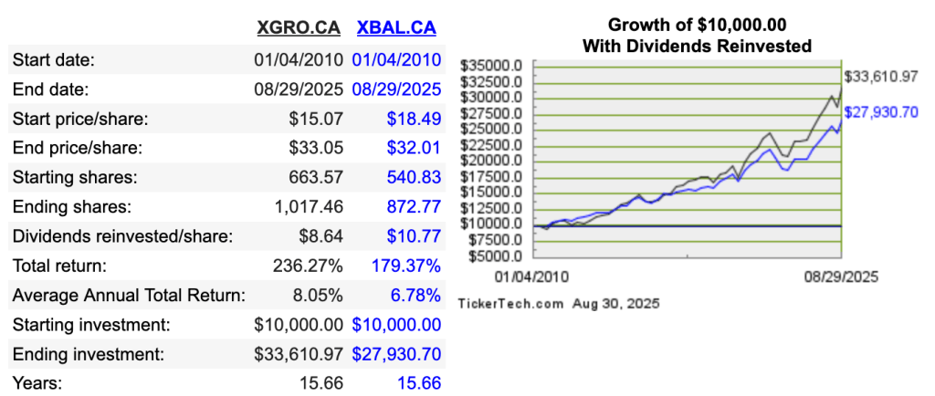
Dealing with Drift in Asset Allocation ETFs

I rely a lot on asset-allocation ETFs in my retirement portfolio, mostly XGRO in the CAD side of the portfolio and AOA on the USD side1. These ETFs (about 70% of my overall retirement portfolio, as you can see here), like all asset-allocation ETFs, rebalance their holdings periodically in order to stick to their asset allocation targets. This aligns perfectly with my way of investing; I’ve always tried to stick to my asset allocation targets portfolio-wide, assisted by tools like my multi-asset tracker spreadsheet. (If you aren’t familiar with asset-allocation as an investment strategy, you could give this article a read.)

XGRO’s asset allocation targets are written right in the prospectus2:

  • 80% Equity, with 36% US equity, 20% Canadian Equity, 20% International Developed Market Equity, 4% Emerging Market Equity.
  • 20% Bonds, 16% being held in Canadian bonds. The other 4% are designated “non-Canadian” but seems like it’s always US bonds.

Anyway, XGRO’s approach to making changes to the portfolio in order to maintain this target percentage is written in the prospectus too:

XGRO’s portfolio will be monitored relative to the asset class target weights and will be rebalanced back to asset class target weights from time to time …XGRO’s portfolio is not expected to deviate from the asset class target weights by more than one-tenth of the target weight for a given asset class

Page 419 of the iShares Prospectus (June 2025)

Now “from time to time” isn’t terribly precise. I thought I’d take a closer look at the history of XGRO’s asset allocations. So I dug through annual and semi-annual reports as well as the website. I focused on the Fixed Income (aka Bond) proportion of XGRO over time because that’s the asset class that’s most likely to drift lower3…equities typically outperform fixed income historically. So this is what I found:

So there is a bit of drift in the fixed income portion of XGRO, but in the past year I haven’t seen it off by more than 1.2%, meaning that the promise made in XGRO’s prospectus is being adhered to.4

Turning now to AOA, the fixed income proportion is clearly stated to be 20%, and rebalancing is stated to happen twice annually, in April and October. After that, things become a bit harder to work out56. The various equity contributions are determined by the target index, namely the S&P Target Risk Aggressive Index, which are constructed by using market capitalization of the various indices used7.

Anyway, like XGRO, what I’m most concerned about is the fixed income portion of AOA, and digging through the various reports, I came up with this:

Of late, the fixed income portion AOA has become small, almost 2% lower than it should be. And given that AOA is about 50% of my holdings, it means that my equity exposure is quite a bit higher than I would let it drift myself.

I suppose the next rebalancing in October 2025 will correct this, but I admit it makes me a little uneasy to see that sort of volatility in the asset allocation8. I could of course just sell some AOA and reinvest it in some bond fund (AOA uses IUSB and IAGG, which seem like fine choices) but then I’m just working around the asset allocation strategy I’m paying for in AOA’s management fees, which seems dumb. Not to mention that anything I do now will almost certainly have to be undone come October.

So I guess this all means I should just let sleeping dogs lie. I have minor bits of money to reinvest every month (I still contribute to my TFSAs) so using those funds to buy bonds are probably what I’ll do. It’s a tiny pre-correction that should be addressed come October…or by the next equity meltdown.

  1. And both are on my “ETF all-stars” page ↩︎
  2. And since detailed targets are clearly stated, these are the percentages I assume for XGRO in my multi-asset tracker spreadsheet. I could continually update the percentages since they calculated daily on XGRO’s page, but it seems like busywork. ↩︎
  3. My retirement decumulation strategy (VPW) relies on knowing what my asset allocation is, too ↩︎
  4. It does mean, however, that my equity exposure Is higher than I thought. ↩︎
  5. Well, or maybe I’m just not that smart — I’m not really sure if one can calculate the market caps needed to work out the allocations. ↩︎
  6. And unlike XGRO, I actually do track (from time to time) the underlying allocations of AOA so that my multi-asset tracker reflects reality. It was through my most recent update that I discovered that the bond portion of AOA was a lot lower than it had been. ↩︎
  7. Namely the S&P500, the S&P MidCap 400, the S&P SmallCap 600, the S&P Developed Ex-U.S. BMI, and the S&P Emerging BMI ↩︎
  8. It’s still within the stated drift that XGRO tolerates, however. So maybe I’m overthinking this. ↩︎

Capped Index Funds: Good Idea?

One nagging concern I’ve heard about index investing1 is that you can end up overly concentrated in a handful of stocks. For example, as of today, per XGRO’s fact sheet, for every $100 I have invested in XGRO, I’m actually investing almost $5 between two companies, NVIDIA and Microsoft. And for every $100 I have invested in AOA, it’s $7 in these two companies. Although that sounds like it might be a significant concentration, I found a way to test the correlation using https://www.portfoliovisualizer.com/asset-correlations. As you can see, XGRO and NVIDIA are not terribly well-correlated:

Not very strong correlation between XGRO and NVIDIA

…even though perhaps I perhaps wish they were (sigh):

Wishing XGRO was more strongly correlated with NVIDIA…

Anyway, if you’re still not comfortable with having too much concentration in your holdings, there are ETFs that limit exposure to any one stock in an index. iShares launched an ETF last year that tracks the S&P 500 while limiting the contribution of any member of that index to 3%. That product is called XUSC, which serves as a complement to its XUS uncapped S&P 500 ETF2. So when you compare XUS’s top holdings to those of XUSC, you can quickly spot the difference:

Top HoldingsXUS (S&P 500)XUSC (capped S&P 500)3
NVIDIA7.86%3.49%
Microsoft7.09%3.12%
Apple5.90%3.07%
Amazon4%3.07%
Meta2.86%2.93%
Broadcom2.49%2.96%
Alphabet class A2%1.66%
Tesla1.73%2.05%
Alphabet class C1.63%1.35%
Berkshire Hathaway1.62%1.93%
Comparing top % holdings between XUS and XUSC as of July 2025

For the TSX, there’s not a full equivalent. The closest pairing for the TSX is XIC4 and XIU:

TickerIndexCapped?# of stocks
XICS&P/TSX Capped CompositeYes214
XIUS&P/TSX 60No615

XIC holds a lot more companies, and in addition to capping any single company, this has the effect of shifting the emphasis to smaller companies. So does this make a big difference in performance? Let’s check using this calculator.

So not much difference; over the past 5.5 years, we see a very slight edge to XIU, the uncapped TSX60 fund.

Whether the relationship between XIU and XIC will be the same as XUS/XUSC is anybody’s guess. In my own case, I don’t own the capped version of the S&P 500, but I do own XIC over XIU, mostly because of its significantly lower MER (0.06% versus 0.18% for XIU).

  1. And my biggest holdings (AOA and XGRO) are nothing more than a collection of index funds: S&P 500, TSX, MSCI EAFE… ↩︎
  2. There’s also currency-hedged variants of these, but I never bother with hedging, it just adds expense and tracking errors. ↩︎
  3. You may wonder why an ETF that advertises itself as capping components at 3% has components that exceed 3%. I also have this question. I suppose they probably only trade when the exception is maintained for a period of time, or perhaps by a more significant margin. Otherwise, they’d trade stocks that hovered around the 3% threshold excessively. ↩︎
  4. The “C” is either for “Capped” or “Composite”, you decide. ↩︎
  5. I can’t explain why a “TSX 60” ETF has 61 assets. Maybe they count cash as the 61st? ↩︎

HISA Table for July 2025

HISAs, for those in the know, are “High Interest Savings Accounts” and offer a nearly zero risk way to earn some interest on your cash holdings. Read all about them here. “Class F” funds are usually available via your online broker, often bought and sold in the same module as mutual funds, although they are NOT mutual funds.

The table hasn’t changed since May1, but I’m going to start adding HISA-alternative ETFs to the table just for comparison purposes. CASH and HISA are frequently-used Canadian ETFs that buy HISAs exclusively. I instead use ZMMK, which does not invest in HISAs at all, but instead uses very short term bonds to generate income. This is admittedly a bit riskier than the alternatives but as long as it pays me a bit of a premium, I’m ok with that. I did a market overview of cash and cash-like ETFs back in March, if you’re interested.

ProviderFundLinkRate SheetRate
RBCRBF2011, RBF2021, RBF2031, RBF2041RBCLink2.55%
ScotiabankDYN6004, DYN5004, DYN3065, DYN3055, DYN3075ScotiabankLink2.70%
Equitable BankEQB1001, ETR1001Equitable Bankn/a2.55%
TDTDB8151, TDB8156, TDB8158, TDB8160TDn/a2.55%
RenaissanceATL5071Renaissancen/a2.55%
Home TrustHOM101,
HOM201
Home TrustLink2.65%
B2BBTB101B2B Bankn/a2.75%
ManulifeMIP610, MIP810Manulifen/a2.40%
National BankNBC200, NBC6200, NBC8200NBI Altamira CashPerformern/a2.55%
Global XCASHCASH Fact Sheetn/a2.55%2
EvolveHISAHISA Fact Sheetn/a2.46%3
BMOZMMKZMMK Fact Sheetn/a2.88%4
Canadian HISA rates, last updated July 11, 2025

Since I hold a substantial amount of USD-denominated ETFs, I also track US interest rates.

ProviderFundLinkRate SheetRate
RBCRBF2015RBCLink4.15%
ScotiabankDYN6005,
DYN5005
ScotiabankLink4.15%
Equitable BankEQB1101,
ETR1101
Equitable Bankn/a3.80%
TDTDB8153TDn/a4.15%
RenaissanceATL5075Renaissancen/a4.15%
ManulifeMIP611Manulifen/a3.30%
National BankNBC201NBI Altamira CashPerformern/a4.15%
Global XUCSHUCSH Fact Sheetn/a4.07%5
EvolveHISUHISU Fact Sheetn/a4.02%6
iSharesICSHICSH Fact Sheetn/a4.70%7
USA HISA rates, last updated July 11, 2025

UCSH and HISU invest in HISAs exclusively; I instead use ICSH which is a rough equivalent of ZMMK in terms of portfolio makeup. Like ZMMK, I enjoy a slight premium in yield as a reward for taking a bit more risk.

  1. The next possible change to Canadian interest rates will be on July 30. The next possible change to US interest rates will be on July 29 or 30, so next month’s table may have some changes, most likely downward. ↩︎
  2. Calculated by dividing most recent distribution (June 30, 2025) by NAV price and multiplying by 12. What the providers show on their ETF fact sheet seems a bit random. ↩︎
  3. Based on June 26 distribution. ↩︎
  4. Based on June 27 distribution ↩︎
  5. Based on June 30 distribution ↩︎
  6. Based on June 26 distribution. ↩︎
  7. Based on July 1 distribution. The 30 Day SEC Yield as of July 2, 2025 shows 4.73% which is in the right ballpark. The SEC Yield appears to be a US effort to provide the investor with apples-to-apples comparisons of current yield. ↩︎

Happy Retirement, Mr. Carrick

Someone to whom I am greatly indebted is Rob Carrick, a personal finance columnist for the Globe and Mail. His insightful columns helped guide me over the course of many years as a DIY investor.

He recently announced his retirement, and I wanted to take this space to wish him well, and to thank him for his help over the course of his career. You made a difference, sir!

Things he has helped me with, just off the top of my head1:

In the course of writing this article, I stumbled across Rob’s guide to ETFs, a new-to-me resource which looks pretty awesome. And even better, it’s not paywalled: https://www.theglobeandmail.com/files/editorial/ebooks/Guide_to_ETFs_-_The_Globe.pdf

Once again, thanks so much Mr. Carrick, and I wish you a long, healthy and income-stable retirement!

  1. All of these are paywalled articles; you can probably get them online through your local library (the OPL link is here). As a subscriber, I have a few free articles I can share monthly, hit me up if interested. ↩︎

What’s in my retirement portfolio (June 2025)

This is a (hopefully1 monthly) look at what’s in my retirement portfolio. The original post is here. Last month’s is here.

Portfolio Construction

The retirement portfolio is spread across a bunch of accounts2:

  • 7 RRIF accounts (3 for me, 3 for my spouse, 1 at an alternative provider as a test)
  • 2 TFSA accounts
  • 4 non-registered accounts, (1 for me, 1 for my spouse, 2 joint)

The target for the overall portfolio is unchanged:

  • 80% equity, spread across Canadian, US and global markets for maximum diversification
  • 15% Bond funds, from a variety of Canadian, US and global markets
  • 5% cash, held in savings-like ETFs.

You can read about my asset-allocation approach to investing over here.

The view as of this morning

As of this morning, this is what the overall portfolio looks like:

Retirement holdings by ETF, June 2025

The portfolio is dominated by my ETF all-stars; anything not on that page is held in a non-registered account and won’t be fiddled with unless it’s part of my monthly decumulation. Otherwise I’ll rack up capital gains for no real benefit.

The biggest changes over the last 30 days was due to a small rebalancing exercise I executed. I sold off some AOA in order to pick up more ICSH. The stock market has been roaring lately, and it caused my target allocations to become a bit cash-poor; ICSH is not, strictly speaking, “cash”, but for my purposes, it’s close enough. (You can read about my cash thoughts here). I could have instead sold XGRO to pick up more ZMMK, but US interest rates are a lot better than Canadian ones at the moment, so I figured I’d enjoy the extra few percentage points of return on my cash holdings.

Plan for the next month

The asset-class split looks like this

This looks to be pretty close to my target percentages which haven’t changed:

  • 5% cash or cash-like holdings like ICSH and ZMMK
  • 15% bonds (almost all are buried in XGRO and AOA)
  • 20% Canadian equity (mostly based on ETFs that mirror the S&P/TSX 60)
  • 36% US equity (dominated by ETFs that mirror the S&P 500, with a small sprinkling of Russell 2000)
  • 24% International equity (mostly, but not exclusively, developed markets)

The pie is looking almost perfect at the moment. I don’t see any near-term need for fiddling with what’s there.

Overall

The retirement savings look quite healthy; even though I’ve been drawing a monthly salary for 6 months, I’m now ahead of where I was3 when I started my retirement journey. This is aligned with what my retirement planner told me to expect, but as you can see, the journey has had some interesting ups and downs aready.

Monthly retirement savings, as percentage of Jan 2025 value

My VPW-calculated salary has gone back to more or less where I started at the beginning of the year. And even with the crazy market swings we’ve seen, it’s stayed remarkably stable4. That’s thanks to the built-in shock-absorber of the VPW model (a 6-month cash cushion which smooths out the market gyrations considerably). I also think it’s an endorsement of my choice to take retirement payments monthly; my exposure to short-term market hiccups is greatly reduced since I’m not making big sales of ETFs to fund a year of spending all at once.

Monthly salary, as percentage of Jan 2025 salary

  1. I know it’s July 7, but the numbers are accurate for June, more or less. ↩︎
  2. I treat retirement savings as firewalled from my day to day chequing account. ↩︎
  3. Just barely, but I’ll take it ↩︎
  4. I changed the vertical axis of this chart to align with the other chart; it makes its stability much clearer. ↩︎