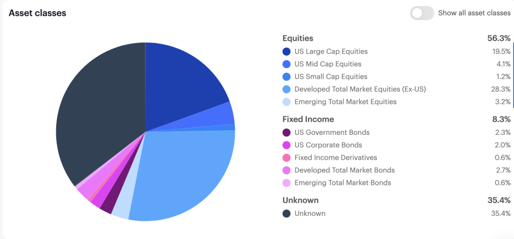

I rely a lot on asset-allocation ETFs in my retirement portfolio, mostly XGRO in the CAD side of the portfolio and AOA on the USD side1. These ETFs (about 70% of my overall retirement portfolio, as you can see here), like all asset-allocation ETFs, rebalance their holdings periodically in order to stick to their asset allocation targets. This aligns perfectly with my way of investing; I’ve always tried to stick to my asset allocation targets portfolio-wide, assisted by tools like my multi-asset tracker spreadsheet. (If you aren’t familiar with asset-allocation as an investment strategy, you could give this article a read.)
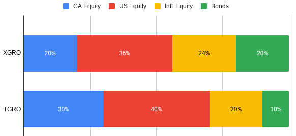
XGRO’s asset allocation targets are written right in the prospectus2:
- 80% Equity, with 36% US equity, 20% Canadian Equity, 20% International Developed Market Equity, 4% Emerging Market Equity.
- 20% Bonds, 16% being held in Canadian bonds. The other 4% are designated “non-Canadian” but seems like it’s always US bonds.
Anyway, XGRO’s approach to making changes to the portfolio in order to maintain this target percentage is written in the prospectus too:
XGRO’s portfolio will be monitored relative to the asset class target weights and will be rebalanced back to asset class target weights from time to time …XGRO’s portfolio is not expected to deviate from the asset class target weights by more than one-tenth of the target weight for a given asset class
Page 419 of the iShares Prospectus (June 2025)
Now “from time to time” isn’t terribly precise. I thought I’d take a closer look at the history of XGRO’s asset allocations. So I dug through annual and semi-annual reports as well as the website. I focused on the Fixed Income (aka Bond) proportion of XGRO over time because that’s the asset class that’s most likely to drift lower3…equities typically outperform fixed income historically. So this is what I found:
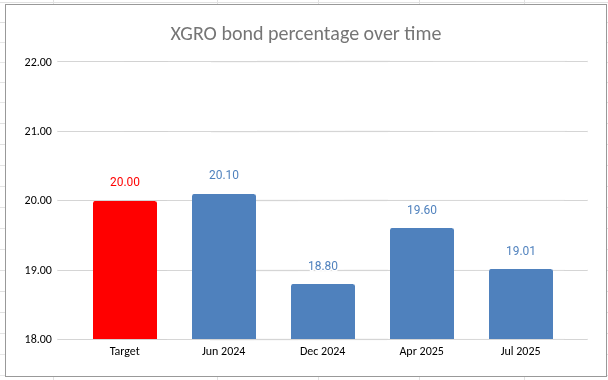
So there is a bit of drift in the fixed income portion of XGRO, but in the past year I haven’t seen it off by more than 1.2%, meaning that the promise made in XGRO’s prospectus is being adhered to.4
Turning now to AOA, the fixed income proportion is clearly stated to be 20%, and rebalancing is stated to happen twice annually, in April and October. After that, things become a bit harder to work out56. The various equity contributions are determined by the target index, namely the S&P Target Risk Aggressive Index, which are constructed by using market capitalization of the various indices used7.
Anyway, like XGRO, what I’m most concerned about is the fixed income portion of AOA, and digging through the various reports, I came up with this:
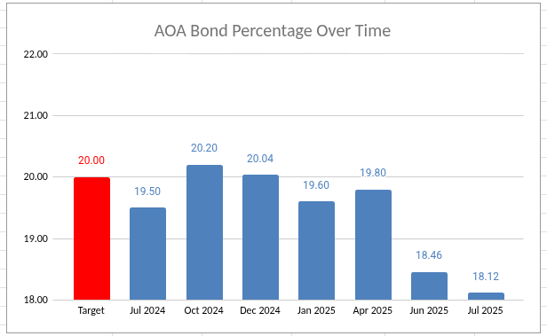
Of late, the fixed income portion AOA has become small, almost 2% lower than it should be. And given that AOA is about 50% of my holdings, it means that my equity exposure is quite a bit higher than I would let it drift myself.
I suppose the next rebalancing in October 2025 will correct this, but I admit it makes me a little uneasy to see that sort of volatility in the asset allocation8. I could of course just sell some AOA and reinvest it in some bond fund (AOA uses IUSB and IAGG, which seem like fine choices) but then I’m just working around the asset allocation strategy I’m paying for in AOA’s management fees, which seems dumb. Not to mention that anything I do now will almost certainly have to be undone come October.
So I guess this all means I should just let sleeping dogs lie. I have minor bits of money to reinvest every month (I still contribute to my TFSAs) so using those funds to buy bonds are probably what I’ll do. It’s a tiny pre-correction that should be addressed come October…or by the next equity meltdown.
- And both are on my “ETF all-stars” page ↩︎
- And since detailed targets are clearly stated, these are the percentages I assume for XGRO in my multi-asset tracker spreadsheet. I could continually update the percentages since they calculated daily on XGRO’s page, but it seems like busywork. ↩︎
- My retirement decumulation strategy (VPW) relies on knowing what my asset allocation is, too ↩︎
- It does mean, however, that my equity exposure Is higher than I thought. ↩︎
- Well, or maybe I’m just not that smart — I’m not really sure if one can calculate the market caps needed to work out the allocations. ↩︎
- And unlike XGRO, I actually do track (from time to time) the underlying allocations of AOA so that my multi-asset tracker reflects reality. It was through my most recent update that I discovered that the bond portion of AOA was a lot lower than it had been. ↩︎
- Namely the S&P500, the S&P MidCap 400, the S&P SmallCap 600, the S&P Developed Ex-U.S. BMI, and the S&P Emerging BMI ↩︎
- It’s still within the stated drift that XGRO tolerates, however. So maybe I’m overthinking this. ↩︎